
Wednesday 11 May 2011
Thursday 7 April 2011
Video Evaluation
This is a video of my group and I talking about our product, how we came to research and create it.
Friday 4 March 2011
Evaluation
Our media product uses, develops, challenges forms and conventions of real media products firstly by the video being a stereotypical love story. It has a narrative that is easy to follow and has a twist. (The girl likes the boy, finally gathers up the courage to face up to him and finds out he is in love with someone else.) This follows the typical conventions of an acoustic music video because it is usually about love and a scenario that can happen in real life. Our narrative fits with our target audience; it is aimed at teenagers 13-20 years old. It fits well because this is situation which presents numerous issues for teenagers to deal with. People can relate to the video and therefore will purchase it.
The video itself is a narrative and a performance, when editing it was suggested that the performance was in black and white, this was there to show it was not part of the narrative.
 This challenges some conventions of a real media product because most of the time the performance is wanted to link directly to the narrative and most of them are in the colour. We thought that by changing this the message of the song will be put across clearly and our artist will be seen more as the singer she is than just a girl acting in a music video.
 We used the artist in the narrative (as shown on the left) because 'use somebody' is her first song, she is new to the music industry and we thought that putting her in the video would help to get the audience recognising her as an artist and listening to her songs.
The video helps develop forms of real media products because it is there to tell a story; for example when the artist is sitting at the window and see the lead male walk past the way she uses facial expressions and body language connotes that she likes him, the way she is hidden behind the window shows that she is shy. We used the shot for when the words "someone like you, and all you know, and how you speak' were sung. We did this so it linked to artists emotion from the shot. We always tried to link the words with the shot to help tell the story but we also developed our knowledge as directors to get the artist to portray this in her acting scenes. We feel this develops forms of real media products because this is what a lot of media products do, especially for the acoustic genre.
We followed typical conventions of media products by using editing to help put our music video together and make it flow. An example of this is when the scene changes; at the beginning of the music video she is watching the sunset. We then put in cross fade, this allows the transition of the shots change smoothly but also acts as a 'dream like' movement in which someone is remembering the story. This fits well with our narrative because the song is a slow tempo and is about the past, things moving slowly or barely changing. The editing programme we used was 'Adobe Premier Elements' .

The Cd covers followed the conventions of a real media product indefinitely. We used a close up of the artist for our front cover image and kept the continuity of font, colour and style through our media products. The close up allows us to advertise the CD when it is on the shelf, it speaks for itself. The audience is drawn into the picture which then leads onto them looking at the name and the CD name. A blur is used in the background to ensure all focus is on the artist and it makes her face stand out more as it contrasts. An effect from Photo Shop ' Lipstick' has been used to make her eyes blue. This stands out against the black and white background and the colour blue connotes calmness and is a natural colour for our outside world (e.g sky) this follows the conventions of the acoustic genre. We made the picture black and white because in the song 'use somebody' for our music video we decided on a narrative and performance. To distinguish between the two, we edited the performance to show in black and white, this is why this picture has been edited in this way to, linking it to our other products. I feel that these edits have followed conventions because real media products will have been edited and changed to make the product itself look better in order to get it to persuade people to buy it.
The tour poster follows the conventions of a real media product because continuity has been kept throughout, the tour poster was one of the last products made and we had to ensure that it reflected the rest of out media products. You can see this with the font; her name is the same and this font resembles a signature which makes it authentic and portrays that this artist is real to the audience. The colour is feminine and stands out against the black Background, once again advertising who the artist is. We have put the dates underneath her name and near the top because they are important information that the audience needs to know, the quicker they find it the more time they have to explore the artist. We have challenged the characteristics of a tour poster slightly as we haven't used an image of the artist on it. That is why the name is at the top and big, because that is how she is going to be recognised. We haven't used a picture because if she is off to do a tour she should have an audience already and will be famous enough to be recognised just by her name at this point. The picture of a set has been used, this set looks like it is ready for the artist to go on stage and perform. We used the chair and microphone in this way because it adds a sense of mystery to the poster and will persuade people to investigate to find out. I think that adding mystery is a good idea because it helps to sell the products.
The combination of our main product, and ancillary texts is effective because it illustrates how we have created a complete promotion package. The video is effective, and we know this because of the positive feedback from our focus groups.As a group we decided to keep the same idea’s in our minds throughout for each product we were creating. This ensured that we could keep a consistent theme and style throughout the media products. This linked them as a package because of the similar styles and themes throughout, when put together and combined, I think our products work very well together. It was important for us to make sure that our music video, CD cover and Tour Poster combined together well and had similarities between them. This is because we wanted out products to look realistic and professional, we wanted them to look the best they could but also link.
We kept the colours, font, artists name the same throughout and this really enhanced the look of our products because there was a consistency. We look at ways in which we could make our products look professional and came up with a music logo 'MOR' this logo can be found on our products and is there to illustrate the music company and also to show the products are linked together.
We asked a total of fifteen questions, below are ten where the focus group picked from one the the answer we had given. The other five required the group to give their own opinion.
We asked an equal amount of females and males to answer the questions and they were from a range of ages. We did this because we could then approach different target audiences as well as the target audience we wanted to aim for. We found that all the participants understood the narrative and this meant that we had clearly portrayed the story and our intentions of the video gave out the message clearly. The audience all thought the video was suitable for teenagers and adults, this illustrated that by setting a target audience
We asked an equal amount of females and males to answer the questions and they were from a range of ages. We did this because we could then approach different target audiences as well as the target audience we wanted to aim for. We found that all the participants understood the narrative and this meant that we had clearly portrayed the story and our intentions of the video gave out the message clearly. The audience all thought the video was suitable for teenagers and adults, this illustrated that by setting a target audience


Technology played a major part in the research construction and production of our products. It helped us use sources to research music videos; which in turn helped us and gave ideas for our music video. We could access CD covers and tour posters to study and analyse and this supported us in making our own because we could look at the codes and conventions which made the ancillary products look professional.
You tube has allowed us access to music videos which we researched and analysed; this helped us look at the music video in detail. We looked at genre characteristics, relationships between lyrics, visuals and the music, inter-textual references. We also camera angles and shots, by doing this we could pick apart the videos and note down what detail we could use and follow in order to create our product to the best it could be.
When evaluating the video we could use you tube as a base in which to advertise the video and create focus groups for feedback. This really helped our evaluation stage because we could gather feedback from people after they had watched the video and then use any opinion they had to correct the video to improve it. It allowed us to target a wider audience from all around the world and see how the evaluation stages of creating a music video works. The evaluation stage on you tube also acts a research stage for the future.
Photoshop is another programme we used for the creation of the CD covers and tour poster. After using the internet to research CD covers and tour poster we explored each one and took traits from them to produce our own. After creating mock ups of what we wanted we began to take pictures to use. Photoshop is an editing programme that helped to manipulate the picture to how we wanted it and to add text and other images.
To construct the CD covers and tour poster we wanted to keep a consistent style throughout and photo shop allowed us to do that because we could save the different fonts and colours to use on each one. We created our own music logo ‘MOR’ and photo shop allowed us to do this through the use of inserting pictures and editing it with text. Photoshop has programmes to create effects and this can be seen on the back of the CD cover, we created a ‘spotlight’ effect and it was to relate to the artist on stage with spotlights but also to act as a way to reveal the songs.
Photo shop has been a good programme to use because it allows you to keep a consistent theme, and can do a number of things in which you can use it to control what you want. Photo shop allows you to give your products a professional look and we had good feedback about it which meant we had followed all the codes and conventions and direected it at the right target audience.
Saturday 5 February 2011
Friday 4 February 2011
Audience Feedback Questionnaire
 This is our audience feedback in graph form, we did the feedback like this because it made it easier to understand and make it easier to evaluate our product. We handed out 10 questionnaires 5 to males and 5 to females; these people were between the ages 11-44+. We did this because we wanted a fair range of people to recieve feedback from.As our target audience was 13-20 females, we thought that asking these two questions would help us to see if we had achieved what we wanted. The results show that the focus group feedback think its is suitable for teenagers and females, however a fair quantity thought it was suitable for both gender which was a bonus for us aswell could expand our audience.
Wednesday 2 February 2011
Tour Poster
This is our tour poster, it follows the design of our CD covers with font, colours and layout. The background is black, this is because it is the same on the CD cover, but also so that the main image and writing stands out.
We used a picture of a chair and microphone as the main image because the album and tour is called I'm ready now. The image shows the stage set up ready for the artist to go on, connoting she is ready now. It also represents the main song form her album; the music video we created "use somebody" because we took the line "I'm Ready Now" from that song. It portrays her life and is telling the audience that she is ready to go out into the music industry.
The artist's name is in the same fount and colour as the CD cover to keep the codes and conventions of typical music commodities. By placing the name at the top, it automatically draws in the audiences attention because of the bright colours and because it is at the top of the poster.
The name of the album is directly underneath, this matches the CD cover and also informs the audience what the tour is called. It is in the colour white because it represents her to be pure and angelic because this is her first tour. It also stands out against the black background, and contrast showing that there is some mystery in her tour because the colour black represents that.
We put the tour dates directly underneath the artist's name so it is the next thing that is seen. We have done this because the audience would want this information as quick as possible.
Overall I think that the tour poster is effective because it creates mystery for the artist, persuading people to see the tour. The people who look at the tour poster will generally have her album and would be her target audience, therefore an image isn't needed to draw the audience in because they would already know who she was.

Saturday 29 January 2011
Cd Cover inners
This is our left Cd cover inner we have kept it extremely simple. We have done this because the focus in on front and back cover and the CD inside the case. By just writing 'I'm Ready Now' in the bottom right-hand corner we are just repeating the name of the CD to the consumer as it is important they remember the name. It is has being kept minimal because all the covers have been edited and designed in the same way.

This is our right CD cover. This also is simple because they CD covers most of it in the case so pictures and elaborate designs are a waste of money and time. We have used the black background again as it is our design of the CD covers. In the bottom right-hand corner we have put the record labels logo. This is there to promote the logo and also to represent the artist.

Cd Cover Back
This is the back of our CD cover. We kept the font and colours the same as the front of the CD, we did this because it is part of the same product and looks tidy, and professional. The back ground is black this colour connotes mystery, however in the top right-hand corner there is a spotlight effect that was edited on 'Photo Shop'. We did this because this CD is part of the artist's show, it gives the effect that it is at a concert and shining on the song titles as if were revealing them.
The song number have been written out in white we did this because the acoustic genre is very relaxed, we did not want our product to be formal with capital letters so we moved away from the conventional ( 1. Rainy Day) and put our own spin on it. The names of the songs follow, they are in the same colour as the artists names showing that they are linked with the artist and they are hers. The names of out songs have been thought about and linked to a theme matching acoustic genres which is love and life. Each title will be a personal song for the artists and their name suggests that. They are down the left third because the spotlight is in the right third and is suppose to revealing the songs in that setup. To make our Product look professional we have added a bar code and a copyright fringment.
We created a logo ( MOR Music) and this represents the artist and puts her with a professional record label and also advertises the record label for future clients. We used the image of headphones in the logo because they are a simple, and great representation of music.
Overall the back of the CD cover has been kept simple, we haven't used an image of our artist on the back because the one used on the front is very powerful and eye catching enough. The simplicity on the this cover suits the genre well.

Cd Cover Front
This is the final front for our Cd Cover. We used a close up of the artist because it will look extremely effective when it is on a shelf. This is because it can be seen from far away and will draw the audiences attention in. Another reason we did a close up is to show off the artists facial expressions which are there to connote 'longing' and 'waiting' this is to reflect our narrative from our music video so it all links together. The artist has minimal makeup on and we asked her to do this to fit the typical conventions of an acoustic singer. Usually they are naturally pretty and do not wear a lot of makeup, this is because this genre is seen as natural and pure; true beauty is within.
This picture has been edited (On Photo shop) from the original so it fits our product well and will sell the product and the artist. Firstly this picture was changed form colour to black and white, we did this because in the song 'use somebody' for our music video we decided on a narrative and performance. To distinguish between the two, we edited the performance to show in black and white, this is why this picture has been edited in this way too. It shows that the artist is the one telling the story even though she is in the narrative you have to separate her from it.
The second edit was cropping the picture, we needed it to be a close up and having too much of the picture ruined this effect. I then used photo shop to blur out the background. I did this because it allows the consumer to focus on her picture and nothing to distract them in the background; the artist is the unique selling point and the most important part of this commodity.
We decided to make her eyes stand out, so I used a tool called 'lipstick' to colour them blue. I did this because it makes her eyes stand out and draws in the attention of potential consumers for the artists music. The colour blue is calming, it can be strong and steadfast or light and friendly and this fits in well with the acoustic genre.
The writing on the CD cover is saying her name 'Lucy Jennings' we used a slanted font; this represented that she was delicate and we wanted it to look like she had signed it herself. The colour we used was a light coral, this colour is very feminine. It contrasts with the background so it stands out and could be related to the summer, illustrating that the album is upbeat and happy. Her name is in the bottom third, I dont think it is important enough to be at the top but she is a new artist and therefore her name is still needed to associate the album with her. The words 'I'm Ready Now' is directly underneath her name. This is the name of the album and is put directly beneath because the audience will see that after they have been drawn in from the picture and the name they see the album name. We used a simple clear font for this because it is there to make a statement, it is to tell the world she is ready to share her music and move out into the society. It is also a main line from the song used for the music video which keeps everything linked and shows its relevance. It is in white so it is seen and that colour is seen as pure; she is just starting out fresh and pure so it reflects her.
Finally the last edit is the border this just finishes the product off nicely as it neatens it up and helps to define the cover image.

Ancillary Texts Drafts


We hand drew some drafts before creating the ancillary texts so that we knew what we wnated before producing them on the computer programmes. It allowed us to see what it would look like before making it and this saved us time because it meant we could simply copy the design onto the computer.

Choosing The Song
We started to research acoustic songs, as that was the genre we chose. We looked on the Internet and came across songs like:
I’m Yours by Jason Mraz
Hey There Delilah by Plain White T’s
Hallelujah by Leonard Cohen
Your Love Is Mine by Corinne Bailey Rae
These songs all represented the acoustic genre well, but were not what we were looking for. We wanted a medium paced song for a female artist to sing. We the looked at Kings Of Leon ' Use somebody' and throughout researching this song we found another version which was covered by Pixie Lott.
Here is the original song not the video.
This is now Pixie Lott's Version with video
There is a significance difference between the two versions and Pixie Lott's version was the perfect song for out artist to sing. We would have to make a few alterations to the pitch of the song to suit our artist and out our own spin on it.
I’m Yours by Jason Mraz
Hey There Delilah by Plain White T’s
Hallelujah by Leonard Cohen
Your Love Is Mine by Corinne Bailey Rae
These songs all represented the acoustic genre well, but were not what we were looking for. We wanted a medium paced song for a female artist to sing. We the looked at Kings Of Leon ' Use somebody' and throughout researching this song we found another version which was covered by Pixie Lott.
Here is the original song not the video.
There is a significance difference between the two versions and Pixie Lott's version was the perfect song for out artist to sing. We would have to make a few alterations to the pitch of the song to suit our artist and out our own spin on it.
Friday 28 January 2011
Cd/ Tour Poster Cover Images
Here are some of the images we considered to use on the CD and Tour poster covers.
 This photo really reflects an acoustic genre. It is sunny and in a park which shows it is all natural and summery. The model has sunglasses on; this illustrates that it is hot and is a common prop for an acoustic artist to have. We saw this in Jason Mraz's 'I'm Yours' music video. The reason we didn't use this video for our CD covers or tour poster is that the picture does not sell the artist. You cannot see her face clearly and therefore it is not as effective as seeing a close up of the artist and been able to see her eyes.
 We used this photo for the front of our CD cover. We did this because it is a close up of the artist, you can see her facial expression clearly; we wanted her face to look as though she is longing for someone. This is because it reflects the song 'use somebody' and the narrative in our music video. The picture has been edited a little to black and white and this is because we wanted it to link to the performance from the music video ( which is also in black and white, to distinguish it from the narrative). We have done this because we wanted to tell the audience that she is the singer,and although she may be in the narrative she is the one telling the story .
This photo really reflects an acoustic genre. It is sunny and in a park which shows it is all natural and summery. The model has sunglasses on; this illustrates that it is hot and is a common prop for an acoustic artist to have. We saw this in Jason Mraz's 'I'm Yours' music video. The reason we didn't use this video for our CD covers or tour poster is that the picture does not sell the artist. You cannot see her face clearly and therefore it is not as effective as seeing a close up of the artist and been able to see her eyes. We used this photo for the front of our CD cover. We did this because it is a close up of the artist, you can see her facial expression clearly; we wanted her face to look as though she is longing for someone. This is because it reflects the song 'use somebody' and the narrative in our music video. The picture has been edited a little to black and white and this is because we wanted it to link to the performance from the music video ( which is also in black and white, to distinguish it from the narrative). We have done this because we wanted to tell the audience that she is the singer,and although she may be in the narrative she is the one telling the story .
Wednesday 19 January 2011
The Project So Far...
We have had three filming sessions so far in which the majority of the video has been filmed. Editing has been going on throughout to make sure that we are ready for the next bit of video. Throughout the filming process, we have found it hard to stay on deadline as our artist is unavailable some of the time. This has a huge effect on us because we struggle to get shots filmed as she is the lead character in our music video.
Another set back for us has been the weather, in order to have good continuity we needed the weather to be dry and light. This isn't only to keep continuity but the snow, would not have fit in with our perception of what an acoustic music video is like; sunny, and bright days.
During the slow progress on the filming we have made use and started creating our CD covers and tour poster with some pictures we took of the artist before.
Monday 10 January 2011
Artists Costume Ideas
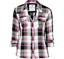
We dressed the artist in a similar top to this when we filmed the studio scenes. We did this because its a laid back outfit which could help to represent the acoustic genre. The artist had a red checked shirt on, but when editing we decided to do the studio scenes in black and white. We thought that it would show simplicity but also reflect how she was feeling if we used these dull colours and made her clothes the same. The black and white was also a way to communicate to the audience that this was not part of the narrative.
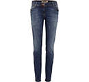 We dressed the artist in some blue skinny jeans. These jeans were just a casual pair, and this just illustrates that the artist is the same as everyone else, she isn't a diva and her music is there for you to relax and chill out to. Once again this was in the studio scenes when it was set to black and white.
 In the opening, ending and woods scene, we dressed the artist in a similar dress to this. it was pastel colours and had flowers on. We did this because we wanted her to keep to the acoustic genre of the girls usually wearing pretty flowery dresses. We also put a coat on her to illustrate the time of year it is,which is winter, as this is usually the time of year when being single affects people most. The coldness of the winter makes people feel down and this song is there to illustrate that it does happen and relate to people who are going through this.
There were many different scenes in which the artist had different clothes on and this was there to show that it was a different day and place. We did this because out narrative involves showing an unrequited loved over time and how everyday when she sees him shes never noticed. The different number of outifts portrays the amount of days she wastes on trying to attract his attention and how that itself didnt work.
Wednesday 15 December 2010
Cd Cover Ideas

I like this Cd cover because the close up of the artist is effective because the audience would clearly see her on the shelf and it would draw them over. The close up is also good because you can see the artists facial expressions, I would like to use the idea of a close up of the artist in my own CD cover. I would use a close up because aforementioned you can see the artist clearly and their facial expressions but also to potential consumers when in a shop the artists face stand out and draw in the buyer; this will then lead them to inquiring about the CD and then to purchase it.
Story Board
This is out story board. It allowed us to make a sequence of the contents in our music video. It helped us to see if shots would work and experiment with different shots. Using the storyboard it allowed us to see what a performance and narrative would look like and where we would put the performance and narrative in our music video.


Before making the shot list and storyboard we annotated our ideas onto a sheet of the lyrics. this helped us to create the storyboard and shot list because we had already noted down what ideas we had for each line and we could then work out a shot form there.

Shot List
 This is our shot list, it helped us to organise the shot type, description of the shot, the timing and the action/person in the shot. This was effective because on each day of filming we could simply look at the shot number and see what we needed to do. It also helped us with the story board which was used as a sketch out for us to see the sequence and make sure it would work.

Monday 22 November 2010
Recce Shots

A Sunrise is also peaceful and this keeps the tranquility and purity of the genre. The sun is seen as a symbol that lights up pathways so having our artist looking into it portrayed that she was looking for another way to go.
 This shot is taken from the park that we filmed some of the ending narrative in. We used the park in the narrative because it is a serene setting and somewhere in which would be a typical place for our lead female to meet the lead male. Parks are natural places full of life and this is a typical stereotype for an acoustic video. The pathway in this picture is where the lead male walks off with another girl, we did this because it represents the life of lead female, who is also the artist. It shows that her life is full of pathways which she never gets to go down because she is always stuck in the middle.
  This is the pathway in which the lead male walks down. At this point in the narrative the lead female thinks he is walking towards her. We did this shot because it could show the lead walking straight past her to the other girl. The pathway crosses her and this once again shows she is stuck in the same place. At the end of this scene she walks up this pathway, this could illustrate that she is always going backwards and never moving forwards.
 This bench is where the lead female is sat, we felt that this was a good place for her to be because it is in the middle of the two pathways and the bench allows us to sit her down at a lower level. This lower level can represent how she feels or put her at a lower status compared to everyone else. This shows she isn't moving on with her life.
Tuesday 16 November 2010
Moodboard For Acoustic Genre

The places I chose were:
- A Skyline, the one on the mood board is the New york skyline. I thought about the city centre skylines in Birmingham that we could use to film a shot like that and considered it as an idea. I think the use of a skyline in the music video suits the genre because when you see a skyline you are usually far away from it, connoting you are in a quiet and peaceful area away from the busy city and this is what I think acoustic music is about being peaceful and calm.
- I also used various pictures of beaches, this is because stereotypically acoustic music is filmed on beaches for example; 'I'm Yours' by Well known artist Jason Mraz. The beach is seen as a natural place where people go to leave their worries behind and by linking the music video to a place like this people could enjoy it.
- There is a picture of the sunset, I am keen to use a sunset in the music video as I think it represents hope and mystery about the next day. When people watch the sunset they are taking there time to witness something beautiful, it makes them peaceful and shows them its the ending of the day. This would be good to have in a music video as it shows when a new days begin/end so it contributes to the narrative. It will illustrate the music video to be calm and natural, and it relates to the lyrics of the song as some is set in the day time and other verses are set at the night.
- A busker, I used this because most buskers play acoustic music. Buskers are there to make money however there are some people who do it for the love of music and this is why I put the lady playing the guitar on there.
- I put the daisies on there because they are stereotypically related to the acoustic genre. Flowers are natural and grow in time and this could be linked in the video to the artist growing in confidence and personality.
- The white dress was used to show purity and innocence. I drew this dress this way because I wanted to show the artist is older and maturer and can show more skin. however because of the target audience, I have kept it reasonably appropriate.
- The guitar is stereotypically associated with the acoustic genre and in our music video we are using a guitar. I put it on the mood board to illustrate that this is the base of a song without this instrument the song would not be as effective
Wednesday 10 November 2010
Audience Theory
Segmentation
Segmentation is how industries categorise groups of people. Each segment has similarities, they are identified as:
GEOGRAPHIC
Region: Where our video is going to be seen.
As a group we think that our video should be shown on a global scale, anywhere in the world that has access to TVs , Internet, Mobiles Etc. This is because we would want as many people as possible to see the video, to promote the music and the artist, so that more people want to listen and see the artist in the future. We want to show this new music to the world, and give them something different to see and listen to. The language of the region where our video is shown is important as they may not understand the English language, however the video is every naturalistic and shows the storyline of whats happening clearly therefore the language shouldn't be a barrier.
Size of Area.
The size of the area is important as larger areas such as cities and villages are more likely to have the products that the music video needs to play on eg. TVs The bigger the area the more places the music video can be seen and spread.
DEMOGRAPHIC
The demographic is the stage where the process of picking which audience is best suited for the video goes into detail and chooses specific qualities about a person and their personal life so that the video can be best suited to the audience and be exactly what the audience want.
PSYCHOGRAPHIC
The psychographic stage is a simple look at the person, it doesn't go into much detail but bases itself on the inner qualities of a person. The video can then be matched to the persons personality etc. which can ensure that they will like the video.
We decided as a group that it would be best to target the people within the 'Puritans' and 'Utopians' group. This was because the qualities in these group is people would feel virtuous and want the world to be a better place to live. We felt that this links to our genre of 'Acoustic' because stereotypically it is known as music that is pure and allows you to be feel to feel and see things. The music is there to represent something, to tell a story; this is what these groups of people want therefore they are more likely to enjoy the music and video that we produce.
Segmentation is how industries categorise groups of people. Each segment has similarities, they are identified as:
- Geographic
- Demographic
- Psychographic
GEOGRAPHIC
Region: Where our video is going to be seen.
As a group we think that our video should be shown on a global scale, anywhere in the world that has access to TVs , Internet, Mobiles Etc. This is because we would want as many people as possible to see the video, to promote the music and the artist, so that more people want to listen and see the artist in the future. We want to show this new music to the world, and give them something different to see and listen to. The language of the region where our video is shown is important as they may not understand the English language, however the video is every naturalistic and shows the storyline of whats happening clearly therefore the language shouldn't be a barrier.
Size of Area.
The size of the area is important as larger areas such as cities and villages are more likely to have the products that the music video needs to play on eg. TVs The bigger the area the more places the music video can be seen and spread.
DEMOGRAPHIC
The demographic is the stage where the process of picking which audience is best suited for the video goes into detail and chooses specific qualities about a person and their personal life so that the video can be best suited to the audience and be exactly what the audience want.
- Age: The music video is aimed at teenagers, more so between the ages 13-20. We thought that this would be the appropriate age group because the video is suitable for as young as thirteen, but also it has clips that are suitable for the older audience and the storyline is more complex for the older viewers. The music video is suitable for audiences above the target audience however it is aimed at teenagers because we feel it tackles the issues teenagers face in today's society and they can relate to the song.
- Ethnicity: The Ethnicity we chose was white British, this isn't there to rule out any other ethnicity, through typical stereotypes other ethnicity's prefer other music such as; RnB, Rapping Etc. We chose White British because the song is filmed in England and the Artist herself is British, we felt if the song and the artist matched the audience we chose, then the people we targeted would buy the song.
- Gender: The gender we chose was female, we thought that this gender would suit best as the artist is female, therefore the audience can relate to the artist as they are of the same gender. The story is about unrequited love stereotypically girls are more interested in this topic so females are the main gender to aim at.
- Generation: The younger generation is the audience, we as a group are aiming at. Teenagers are more likely to watch the video as they have more time an tend to watch the t,v use the Internet more etc to get access to watch the video. It is also more suited for them as if tackles issues that teenagers today struggle with.
- Social Class: The social class we are aiming at is middle class. We are aiming at this class because the majority of people are middle class. They own the technology that the video need to play on. Middle class people are generally educated, and will follow the narrative well.
PSYCHOGRAPHIC
The psychographic stage is a simple look at the person, it doesn't go into much detail but bases itself on the inner qualities of a person. The video can then be matched to the persons personality etc. which can ensure that they will like the video.
We decided as a group that it would be best to target the people within the 'Puritans' and 'Utopians' group. This was because the qualities in these group is people would feel virtuous and want the world to be a better place to live. We felt that this links to our genre of 'Acoustic' because stereotypically it is known as music that is pure and allows you to be feel to feel and see things. The music is there to represent something, to tell a story; this is what these groups of people want therefore they are more likely to enjoy the music and video that we produce.
- Personality: We want the audiences personality to be calm and relaxed when they see the video and hear the song. They need to be open to all music as we have taken a song that is not associated with the 'Acoustic' Genre but have made it that. The audience also needs to withhold the trait of romance; we made our video represent "unrequited love" and this is a common thing in everyday life.
Thursday 14 October 2010
Change In Groups
Our group first started out with four people, as we first started to pitch our ideas we agreed to choose the genre acoustic. When it came to choosing an artist and song to use in our music video we found that there was a difference in opinion of what artist and song we wanted to do. As a group we tried to settle the difference but it ended in three members agreeing and one disagreeing, this lead to the one member leaving to form another group. My two other group members and I agreed on what song and artist we wanted and the narrative of the story and are ready to begin filming as a group.
I think that this was the right decision because if there was complications with agreeing on certain elements for the music video and that was just with planning,the final product could be ruined because of the lack of enthusiasm from the member who didn't like the ideas.
I think our final product will benefit a lot more with just the three members because we all have the same opinion about what we want, we chose an artist and song quite quickly that we like and managed to create a narrative too. This ensures that as group we get our work done and do it to the best of our ability.
Choosing The Artist
The girl we first asked to sing and perform in our music video provided us with CD’s of her singing. We liked her voice but she sounded quite muffled and quiet. The clarity of the words was not audible and we struggled to understand what she was singing. We then asked her to record four songs for us they were:
· Foundations- Kate Nash
· Thinking of you- Katy Perry
· Break-even- The Script
· Use Somebody- originally by Kings Of Leon, however we wanted the cover version by Pixie Lott
When we had the CD back she had only covered one of the songs we asked her to do and the clarity had improved but when listening to the Pixie Lott version as a group we decided that her voice wouldn’t suit the song as it sounded more like Kate Nash.
We had already picked someone to appear in the video to “be” the artist she fitted our genre well as stereotypically female acoustic singers have long blonde hair, they are generally pretty, are calm and free-spirited. This girl also became our singer as she had the perfect voice to match the song.


We now have an artist and song that we are going to use for our music video, the whole group agrees that the artist is right for the song. We are having another girl play the guitar this will make it acoustic however she will not appear in the video.
Video Analysis Jason Mraz 'Im Yours'
This video is called ‘I’m yours’ by Jason Mraz. It is known as acoustic music; stereotypically it is slow to medium speed and has one artist. The video started with a high angle shot of an aeroplane this immediately gives the audience the idea that the video is an adventure and set abroad. The artist is in the second shot, we don’t see his face but we see the hat that is usually associated with the artist and that tell the audience who he is. The different shots in the video illustrate the acoustic genre because it is commonly known to be free-spirited and light hearted. The video portrays these qualities for example, when the artist is sitting in the open top car he is singing away and dancing showing he has no care in the world and loving life.
The music and lyrics play throughout but you don’t always see the artist singing, this is good because if the audience just saw the artist singing it would be boring and they would soon lose interest. The video keeps the audience interested by showing adventure, one shot that demonstrates this is when the artist jumps of the cliff into a pool which has a waterfall. This would be seen as a thrilling event and makes the audience think the artist is fearless and fun.
The lyrics and visual during the song don’t have much of a relationship for example: “open up your mind and see like me, open up your plans and dam you’re free” these lyrics are set with a visual of skaters; this doesn’t represent him or any of his plans. There is a small relationship when referring to love, and being free, other than that little relationship between lyrics and video.
The relationship between the music and visuals is the music cohesion to the visual is good as the music is simple but exciting and has a summery holiday sound to it, for example Hawaiian. It relates to the visuals well as the video is set abroad and a visual of a beach is used which is usually associated with holidays with links to the holiday sound it seems to have.
The artist rarely looks at the camera, it illustrates he is distracted by the scenery, however I think that it could show he is trying to keep the video realistic as you wouldn’t have a camera following you around everywhere. It shows he is really into his music and takes it seriously.
The video has some intertextual references it refers to relationships and that God wants us to love and be loved, to see the world as a whole and to be inspired.
Summary Of Video
Genre Characteristics:
Acoustic some soul included
Relationship between lyrics and visuals:
Small relationship when referring to love, and being free, other than that little relationship between lyrics and video.
Relationship between music and visuals:
The music in cohesion to the visual is good as the music is simple but exciting and has a summery holiday sound to it, for example Hawaiian. It relates to the visuals well as the video is set abroad and a visual of a beach is used which is usually associated with holidays with links to the holiday sound it seems to have.
Closes-ups of the artist and star image motifs:
There are many close-ups of the artist at many different angles. The star image motifs are the hat he wears it is seen a numerous amount of times, water plays a part in the video. At the start we see a fish tank, then a waterfall, and finally the sea.
Is there reference to the notion of looking?
The artist rarely looks at the camera; he seems distracted by all the scenery.
Are there intertextual references?
Yes it refers to relationships and that God wants us to love and be loved. To see the world as a whole and to be inspired.
Video Analysis Taylor Swift 'Crazier'
This video is called ‘Crazier’ by Taylor Swift. The songs genre is acoustic and was in a film, this shows the artist singing on stage and then had a narrative of the film in it. The opening of the music video is a scene from the film ‘The Hannah Montana Movie’; it starts with a long shot of the room. This long shot allows the audience to see where the video is set and what time period it is. The music plays straight away and already illustrates to the audience that this is an acoustic song because you can hear the guitar clearly but also it pan around the artist on stage to see what instruments are playing. The audience by now can see it is staged in a barn and is a typical stereotype of the ‘acoustic genre’ as it creates a country feel to the music and scene. The audience can also see in that it is night time and with the actors in the video dancing in couples immediately portrays it is a love song.
We see a medium close up of the artist in the first fourteen seconds of the video, and this is when the first lyric is sung. The artist has long blonde hair hardly any makeup on, I like the idea of using someone who looks similar to Taylor Swift because it reflects the acoustics artist quite well. The lack of makeup shows true beauty and this is someone I would love to use as a role model. So when picking my artist I will be looking for those qualities. The artist looks happy and relaxed in the opening with allows the audience to mimic this and relax as well.
When the music begins to change at thirty five seconds the clip onscreen also changes to the narrative; which is scenes from the film. This change is good because it goes with the tempo change of the music (which is getting faster) and the pitch (which is getting higher and louder). This catches the audience’s attention because of the change in the music and keeps them entertained. When we do see the narrative from the film we horses running freely in a field and two characters laughing. Horses are associated with the acoustic genre because it branches out from the “country link” and the fields are a common associate of the acoustic genre when people are asked what they think of when they hear acoustic music; fields is always mentioned as it is seen as a place where its quiet and away from the globalised world of motorways and factories.
One again as aforementioned the music changes and so does the clip; this time it goes back to the barn. I like the idea of switching from performance to narrative when the music changes, or on certain lines and would like to incorporate something like this in my music video. Throughout the performance the camera constantly changes from a medium shot left of the artist to the right. I think that this is good because you get to see the artist from different angles however this is a minute and a half into the video and we haven’t seen a close up of the artist yet. At this same point there is a cross-dissolve edit from the performance to the narrative and I really like this idea because it isn’t a jump cut. It makes it look undisturbed as it takes you form one clip to the other and I think I will use this cross-dissolve in my video.
The end of the music video goes back to the stage area where it first began, I hope to incorporate the idea of the video starting and ending in the same place because it is a great way to show time and the emotion- whether it has changed from the start etc. The video ends and fades out, this is a good way to end a video as it is saying the story has finished, that is the end.
The lyrics and visual during the song do a fit perfectly as when the artist says lines such as “then you came along and you changed everything” the narrative is played and the male lead is then pictured. This give the audience an idea that this song is about a boy and is suppose to be sung by a girl.
The relationship between the music and visuals is good because it is a slow paced song and the performance is slow and graceful. When watching the narrative you can see that some faster scenes have been edited to slow down to match this tempo, this is good because the video would not have the same effect on people if the clips were fast as it doesn’t suit what they song is telling them.
Subscribe to:
Posts (Atom)