Saturday 29 January 2011

Cd Cover inners

This is our left Cd cover inner we have kept it extremely simple. We have done this because the focus in on front and back cover and the CD inside the case. By just writing 'I'm Ready Now' in the bottom right-hand corner we are just repeating the name of the CD  to the consumer as it is important they remember the name. It is has being kept minimal because all the covers have been edited and designed in the same way.

This is our right CD cover. This also is simple because they CD covers most of it in the case so pictures and elaborate designs are a waste of money and time. We have used the black background again as it is our design of the CD covers. In the bottom right-hand corner we have put the record labels logo. This is there to promote the logo and also to represent the artist.

Cd Cover Back

This is the back of our CD cover. We kept the font and colours the same as the front of the CD, we did this because it is part of the same product and looks tidy, and professional. The back ground is black this colour connotes mystery, however in the top right-hand corner there is a spotlight effect that was edited on 'Photo Shop'. We did this because this CD is part of the artist's show, it gives the effect that it is at a concert and shining on the song titles as if were revealing them.
The song number have been written out in white we did this because the acoustic genre is very relaxed, we did not want our product to be formal with capital letters so we moved away from the conventional ( 1. Rainy Day) and put our own spin on it. The names of the songs follow, they are in the same colour as the artists names showing that they are linked with the artist and they are hers. The names of out songs have been thought about and linked to a theme matching acoustic genres which is love and life. Each title will be a personal song for the artists and their name suggests that. They are down the left third because the spotlight is in the right third and is suppose to revealing the songs in that setup. To make our Product look professional we have added a bar code and a copyright fringment.
We created a logo ( MOR Music) and this represents the artist and puts her with a professional record label and also advertises the record label for future clients. We used the image of headphones in the logo because they are a simple, and great representation of music.
Overall the back of the CD cover has been kept simple, we haven't used an image of our artist on the back because the one used on the front is very powerful and eye catching enough. The simplicity on the this cover suits the genre well.

Cd Cover Front

This is the final front for our Cd Cover. We used a close up of the artist because it will look extremely effective when it is on a shelf. This is because it can be seen from far away and will draw the audiences attention in. Another reason we did a close up is to show off the artists facial expressions which are there to connote 'longing' and 'waiting' this is to reflect our narrative from our music video so it all links together. The artist has minimal makeup on and we asked her to do this to fit the typical conventions of an acoustic singer. Usually they are naturally pretty and do not wear a lot of makeup, this is because this genre is seen as natural and pure; true beauty is within.
This picture has been edited (On Photo shop) from the original so it fits our product well and will sell the product and the artist. Firstly this picture was changed form colour to black and white, we did this because in the song 'use somebody' for our music video we decided on a narrative and performance. To distinguish between the two, we edited the performance to show in black and white, this is why this picture has been edited in this way too. It shows that the artist is the one telling the story even though she is in the narrative you have to separate her from it.
The second edit was cropping the picture, we needed it to be a close up and having too much of the picture ruined this effect. I then used photo shop to blur out the background. I did this because it allows the consumer to focus on her picture and nothing to distract them in the background; the artist is the unique selling point and the most important part of this commodity.
We decided to make her eyes stand out, so I used a tool called 'lipstick' to colour them blue. I did this because it makes her eyes stand out and draws in the attention of potential consumers for the artists music. The colour blue is calming, it can be strong and steadfast or light and friendly and this fits in well with the acoustic genre.
The writing on the CD cover is saying her name 'Lucy Jennings' we used a slanted font; this represented that she was delicate and we wanted it to look like she had signed it herself. The colour we used was a light coral, this colour is very feminine. It contrasts with the background so it stands out and could be related to the summer, illustrating that the album is upbeat and happy. Her name is in the bottom third, I dont think it is important enough to be at the top but she is a new artist and therefore her name is still needed to associate the album with her. The words 'I'm Ready Now' is directly underneath her name. This is the name of the album and is put directly beneath because the audience will see that after they have been drawn in from the picture and the name they see the album name. We used a simple clear font for this because it is there to make a statement, it is to tell the world she is ready to share her music and move out into the society. It is also a main line from the song used for the music video which keeps everything linked and shows its relevance. It is in white so it is seen and that colour is seen as pure; she is just starting out fresh and pure so it reflects her.
Finally the last edit is the border this just finishes the product off nicely as it neatens it up and helps to define the cover image.

Ancillary Texts Drafts


We hand drew some drafts before creating the ancillary texts so that we knew what we wnated before producing them on the computer programmes. It allowed us to see what it would look like before making it and this saved us time because it meant we could simply copy the design onto the computer.

Choosing The Song

We started to research acoustic songs, as that was the genre we chose.  We looked on the Internet and came across songs like:
I’m Yours by Jason Mraz
Hey There Delilah by Plain White T’s
Hallelujah by Leonard Cohen
Your Love Is Mine by Corinne Bailey Rae


These songs all represented the acoustic genre well, but were not what we were looking for. We wanted a medium paced song for a female artist to sing. We the looked at Kings Of Leon ' Use somebody' and throughout researching this song we found another version which was covered by Pixie Lott.
Here is the original song not the video.


This is now Pixie Lott's Version with video


There is a significance difference between the two versions and Pixie Lott's version was the perfect song for out artist to sing. We would have to make a few alterations to the pitch of the song to suit our artist and out our own spin on it.

Friday 28 January 2011

Cd/ Tour Poster Cover Images

Here are some of the images we considered to use on the CD and Tour poster covers.
This photo really reflects an acoustic genre. It is sunny and in a park which shows it is all natural and summery. The model has sunglasses on; this illustrates that it is hot and is a common prop for an acoustic artist to have. We saw this in Jason Mraz's 'I'm Yours' music video. The reason we didn't use this video for our CD covers or tour poster is that the picture does not sell the artist. You cannot see her face clearly and therefore it is not as effective as seeing a close up of the artist and been able to see her eyes.

We used this photo for the front of our CD cover. We did this because it is a close up of the artist, you can see her facial expression clearly; we wanted her face to look as though she is longing for someone. This is because it reflects the song 'use somebody' and the narrative in our music video. The picture has been edited a little to black and white and this is because we wanted it to link to the performance from the music video ( which is also in black and white, to distinguish it from the narrative). We have done this because we wanted to tell the audience that she is the singer,and although she may be in the narrative she is the one telling the story .

Wednesday 19 January 2011

The Project So Far...

We have had three filming sessions so far in which the majority of the video has been filmed. Editing has been going on throughout to make sure that we are ready for the next bit of video. Throughout the filming process, we have found it hard to stay on deadline as our artist is unavailable some of the time. This has a huge effect on us because we struggle to get shots filmed as she is the lead character in our music video.
Another set back for us has been the weather, in order to have good continuity we needed the weather to be dry and light. This isn't only to keep continuity but the snow, would not have fit in with our perception of what an acoustic music video is like; sunny, and bright days.
During the slow progress on the filming we have made use and started creating our CD covers and tour poster with some pictures we took of the artist before.

Monday 10 January 2011

Artists Costume Ideas


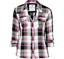
We dressed the artist in a  similar top to this when we filmed the studio scenes. We did this because its a laid back outfit which could help to represent the acoustic genre.  The artist had a red checked shirt on, but when editing we decided to do the studio scenes in black and white. We thought that it would show simplicity but also reflect how she was feeling if we used these dull colours and made her clothes the same. The black and white was also a way to communicate to the audience that this was not part of the narrative.


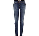
We dressed the artist in some blue skinny jeans. These jeans were just a casual pair, and this just illustrates that the artist is the same as everyone else, she isn't a diva and her music is there for you to relax and chill out to. Once again this was in the studio scenes when it was set to black and white.


Blue Pattern (Blue) Piped Daisy Dress | 211671949 | New LookIn the opening, ending and woods scene, we dressed the artist in a similar dress to this. it was pastel colours and had flowers on. We did this because we wanted her to keep to the acoustic genre of the girls usually wearing pretty flowery dresses. We also put a coat on her to illustrate the time of year it is,which is winter, as this is usually the time of year when being single affects people most. The coldness of the winter makes people feel down and this song is there to illustrate that it does happen and relate to people who are going through this.


There were many different scenes in which the artist had different clothes on and this was there to show that it was a different day and place. We did this because out narrative involves showing an unrequited loved over time and how everyday when she sees him shes never noticed. The different number of outifts portrays the amount of days she wastes on trying to attract his attention and how that itself didnt work.